What are effective squeeze pages? You’ve seen them right? A great squeeze page doesn’t pressure you into handing over your email address—it makes you want to. When the content, colors, layout, and emotional flow all work together, the reader naturally leans in, nods along, and thinks, “Yes… this is exactly what I’ve been looking for.” That’s the real magic of an effective squeeze page: it creates a positive emotional experience that leads to an easy, natural opt‑in.
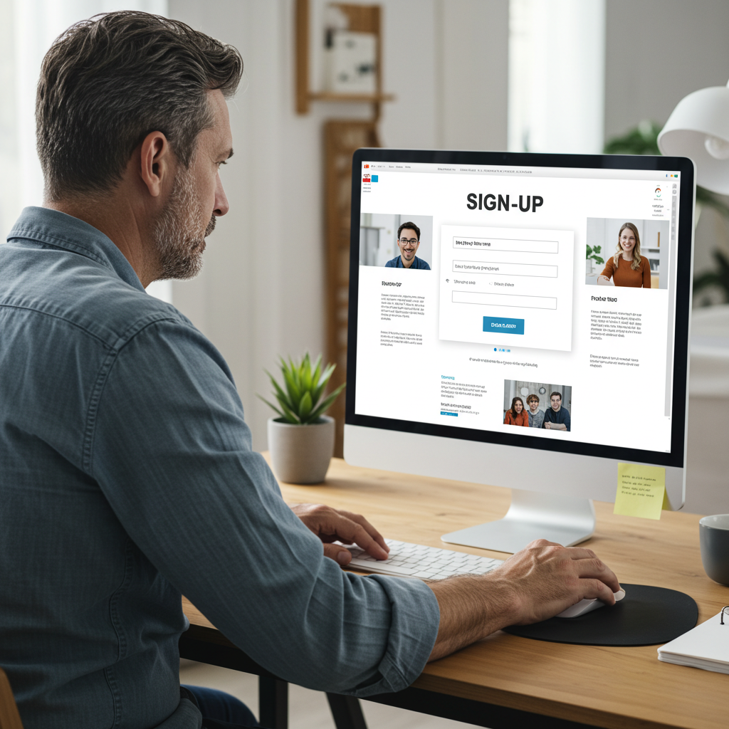
What a Squeeze Page Really Needs to Do
At its core, a squeeze page has one job: capture an email address. But the way you guide someone to that moment matters. A high‑performing squeeze page builds trust quickly and creates a sense of clarity and confidence. It reduces hesitation by making the offer feel simple, valuable, and relevant. When everything on the page works together, the reader feels understood and supported, which puts them in a YES frame of mind before they even reach the opt‑in form.
Color Psychology: Setting the Mood
Color is one of the fastest ways to influence how someone feels when they land on your page. Blue often creates a sense of trust and calm, while green conveys growth and balance. Orange brings a friendly sense of enthusiasm and action, and yellow adds a spark of optimism and creativity. A clean black‑and‑white layout can also feel modern and authoritative.
The key is choosing colors that work together and support the emotional tone of your offer. Your call‑to‑action button should stand out with a contrasting color so the eye is naturally drawn to it without feeling forced.
Layout: Keep It Simple and Focused
The most effective squeeze pages are clean, simple, and free of distractions. Too much clutter creates confusion. A strong layout usually starts with a headline that grabs attention and immediately communicates the main benefit. A short subheadline can clarify what the reader will gain, followed by a visual element—like a mockup or simple graphic—that reinforces the offer.
Instead of overwhelming the reader with long lists and text, a few short, clear statements explaining what they’ll receive is enough to build interest. The opt‑in form should be easy to find and even easier to complete, ideally asking only for an email address. A small trust element, such as a brief testimonial or a simple privacy note, helps reassure the reader that they’re making a safe choice.
Content That Makes You Want to Say YES
Your copy should feel like a friendly conversation rather than a sales pitch. When readers feel like you understand their challenges and can help them solve a specific problem, they naturally become more receptive. Using empathetic language helps them feel seen, while clear explanations of what they’ll learn or gain help them feel confident. Specific details—like how long something takes or what steps are involved—make the offer feel manageable.
The more your content helps the reader think, “This is exactly what I need,” the easier it becomes for them to say yes. Also, keeping the tone warm, helpful, and straightforward builds trust without hype.
Examples of Attention‑Grabbing Headlines
A strong headline is often the difference between someone staying on your page or clicking away.
Benefit‑driven headlines work well because they immediately show the reader what they’ll gain. For example, a headline like “Grow Your Email List in 10 Minutes a Day—Even If You’re Starting From Zero” speaks directly to a desired outcome.
Curiosity‑based headlines, such as “Why Most New Marketers Fail (and the 5‑Minute Fix That Changes Everything)”, pull the reader in by hinting at something they don’t know yet.
Problem‑solution headlines are also powerful because they acknowledge the reader’s struggle and offer a clear path forward. A headline like “Struggling to Stay Consistent? Download the 90‑Day Action Plan That Actually Works” immediately connects with a common pain point.
Quick‑win headlines—such as “Get My 5 Highest‑Converting Email Templates—Free”—promise something fast, useful, and easy to consume.
The Offer: Make It Feel Like a No‑Brainer
Your lead magnet should feel like a helpful shortcut, not homework. People love resources that are easy to use and immediately valuable, such as checklists, templates, swipe files, short guides, or simple planners. The more specific and actionable your offer is, the more likely someone is to opt in. When the reader feels like they’re getting something that will save them time, reduce frustration, or help them take the next step, the decision becomes effortless.
Trust Elements That Boost Conversions
Even a small amount of reassurance can make a big difference. A friendly photo of you helps humanize the page, while a short credibility line—something as simple as “Helping over 1,200 new marketers get started”—adds authority without bragging. A brief testimonial or a simple privacy note reminding them that you won’t spam them can also reduce hesitation.
Final Thoughts: Keep It Simple and Human
The most effective squeeze pages aren’t complicated. They’re clear, friendly, and focused on helping the reader take one small step forward. When your colors, layout, and copy all work together to create a positive emotional experience, the reader naturally says YES.
Here’s an example of a squeeze page I created
using the Page Builder tool at Leadsleap.
I’ve had good success with this one. Tell me what you think… can I improve it? What does it lack? What can I change? Your feedback is appreciated, and hopefully you’ll discover what YOU should/should not do when building your own effective squeeze page.

Keith Dyer shares practical tips, tools, and resources to help make building income online simpler and more approachable. Through this website, Keith provides helpful content and recommendations, including the Plug-In Profit Site, a system designed to help beginners get started online with a website, step-by-step training, and built-in income streams. Learn more about getting started with Plug-In Profit Site HERE.